Data visualization
My Uber Rides
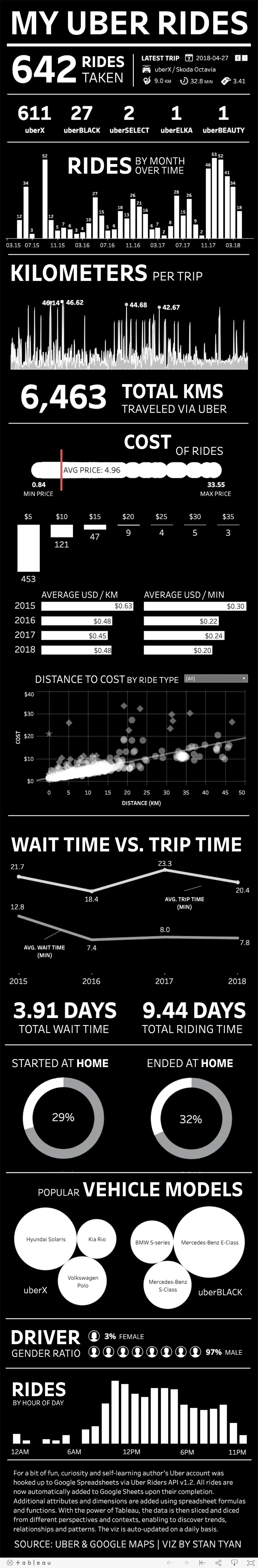
A personal data project that connected Uber ride history to Google Sheets and Tableau for daily-updated visual analysis.

Published
Technologies
Uber Riders API · Google Sheets · Python · SQL · Tableau
Links
Why the project existed
This project started as something built for fun, curiosity, and self-learning. It was a personal data project, and also a compact example of lightweight analytics engineering.
The aim was simple: collect ride data automatically, enrich it, and look for patterns that would be hard to see from the raw trip history alone.
How the pipeline worked
The workflow was:
- An Uber account was connected to Google Sheets through the Uber Riders API.
- Completed rides were added to the sheet automatically.
- Additional attributes and dimensions were created with spreadsheet formulas and functions.
- Tableau was used to slice the data from different perspectives and contexts.
That workflow sits somewhere between personal logging and a miniature BI stack. The tools are light, but the pattern is familiar: automate collection, enrich the data, then make it explorable.
The fully featured Tableau dashboard is not embedded on phone-sized screens because the Tableau Public view does not resize cleanly there.
This Tableau Public dashboard is blocked until external media is allowed.
What the dashboard showed
The dashboard sliced the ride data by recent activity, trip type, timing, price, and other dimensions that were easier to inspect visually than in the raw trip log.
The point was to explore the ride history from several angles and surface trends, relationships, and patterns that would otherwise stay buried in the data.
Datasets
The underlying ride dataset is also available as a direct download in two formats. The CSV version preserves the original tabular export, and the JSON version mirrors the same 678 records with every field kept as a string to avoid type conversion or formatting loss between formats.